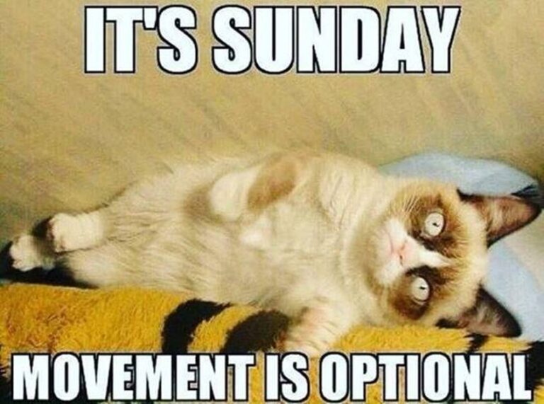
Not much new to report in the new frontier of blogging on Civatar. I have been tinkering a bit with making an album and made one a few days ago and originally had it on several pages using page breaks. Today I tried to do something different and just made sub menus for the additional pages, but I believe I will go back and use page breaks, as using more than one sub menu under albums is very awkward. Page 2 works well, but page three scrolls off to the side of page 2 instead of defaulting under it. That may be able to be fixed under some other setting, but it isn’t as tidy as the page breaks, but I think sub menus would work well if there is only one other page under the original menu item. But for each of us, it’s a personal preference. I will leave it up for now and change it back later if anyone wants to see how it works with more than one page under a sub menu item.
At this point in my entry, I am just experimenting a bit. I am going to try to add a pic further down on this post after a paragraph or two to see whether or not the pic will show on the activity page. I noticed last time I wrote a blog with pics, I had written a small bit first and then added the pics for the comic and it showed most of the typed entry and one pic. (Bare with me as I insert a pic here and then go on to further explain my full thought)…

My concern lately has been the feed on the front activity page. Once our old Shmoozezone site goes down, I imagine (hope!) that the activity feed will become a lot more active. As we grow it will increase with the added members and posts.
I was wondering, if/when the posts increase will the activity posts shown decrease in size? Over on Shmoozezone when a blog or post is made, they are posted on the front page and they are all the same size, no matter the content. Will that happen here as well? Or will it stay the same as it currently is? Why I am asking is that some members don’t always post a lot of graphics or pics in some of their blogs.
For an example, (hope you don’t mind), Cosmic’s blogs are geared more to thoughts and ideas and words rather than pics. Suzi, when she posts her poems, usually just has the poem. Sometimes she might include a pic or graphic but not always. I guess my concern is that some people’s blogs are going to get “lost” in the more pic/graphic heavy posts in the activity feed and scroll off/down the page and go unnoticed. Right now it’s no big deal as there isn’t much traffic, but when things get busier I can see it happening.
I like all the pics, I like all the graphics, I use them as much as anyone. I was just wondering if say, we got 30 posts one day, would the feed just crunch everything smaller? Is there a way for us to default our posts so that they don’t overshadow other posts? Or a way to have them all the same size, like they are over on our old site, so one can see at a glance what is new? Just curious, and I don’t want anyone to think I am finger pointing or upset by their pics and posts. I enjoy having the big pics on the actual posts themselves, because sometimes they include writing which can be small, and the bigger pic shows more detail.
I was going to post this over on the forum, but heck, I figured the way I ramble I might as well put it into a blog post. And also because, I wanted to test the pic I included as well to see if it showed on the feed or not.
Thoughts? Ideas? Suggestions? Perhaps it’s no big deal, and I am putting the cart before the horse, and we need to see how things progress as time speeds up.
Have a good day bloggers.
Well shoot, that is what I was worried about. I didn’t want a huge graphic to show but the first paragraph of my blog post.
I will have to post again later today and write something lengthy again and put the graphic at the bottom and see how it posts.
👍